The Arctic is thawing. Now there’s an app to track it.
- Updates
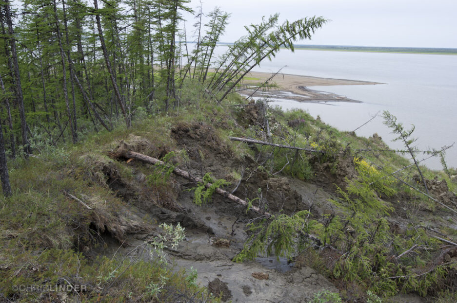
Thawing permafrost in Siberia. Photo by Chris Linder
New app allows users to visualize Arctic data
Across the Arctic and boreal zone, the region comprising the forests south of the Arctic circle and the tundra and terrain above it, perennially frozen ground called permafrost is thawing. And it’s been thawing for decades, triggered by human-caused climate warming that’s led the region to warm three to four times faster than anywhere else on the planet.
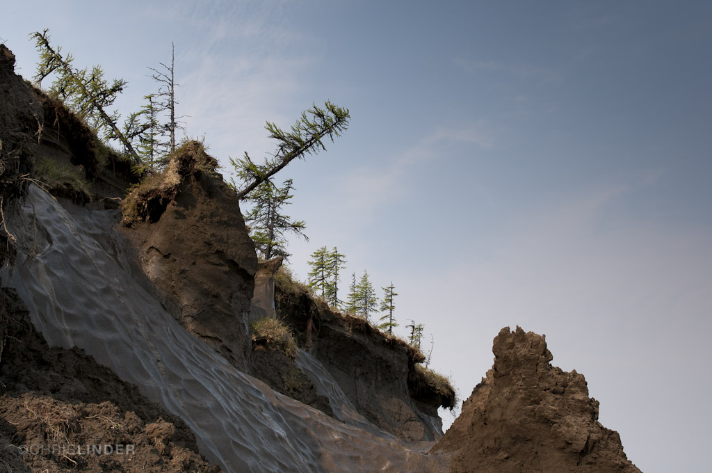
Thawing permafrost and erosion in Siberia. Photo by Chris Linder
But the ground is thawing unevenly, fueled by a complex web of factors and feedbacks such as air temperature, surface hydrology, snow physics, and how much ice the ground contains.
Air temperature is not affecting the region in the same way, either. Western Canada, Alaska, and Siberia have seen significant warming trends over the last several decades, while parts of eastern Canada have experienced a cooling trend in recent decades.
Thawing Arctic-Boreal Zone app dashboard. Screenshot courtesy of Woodwell Climate Research Center
Now researchers and students can explore the varied warming trends across the North using a free-to-use app from Permafrost Pathways and collaborators at Esri.
The “Thawing Arctic-Boreal Zone,” or TABZ app, powered by satellite and air temperature data, grew out of a collaboration that began in 2020 between Woodwell Climate Research Center (Woodwell Climate) and the global GIS software company Esri. Built on more than 40 years’ worth of near-surface air temperature and remote sensing data, the app can deliver decades of temperature and frozen ground trends at any coordinate in the North.
Developers of the TABZ app imagined it as a tool for people who are interested in exploring the warming patterns that are contributing to a host of Arctic impacts, including permafrost thaw, flooding, erosion, and increasingly frequent wildfires.
“It’s been exciting to imagine how we can share this climate data we’re gathering, beyond publishing a scientific study,” said Jennifer Watts, an associate scientist for Permafrost Pathways at Woodwell Climate and one of the app’s developers. “We hope that offering our new tutorial and future workshops like the one we hosted with Arctic Initiative can help more people to access and get something out of this tool.”
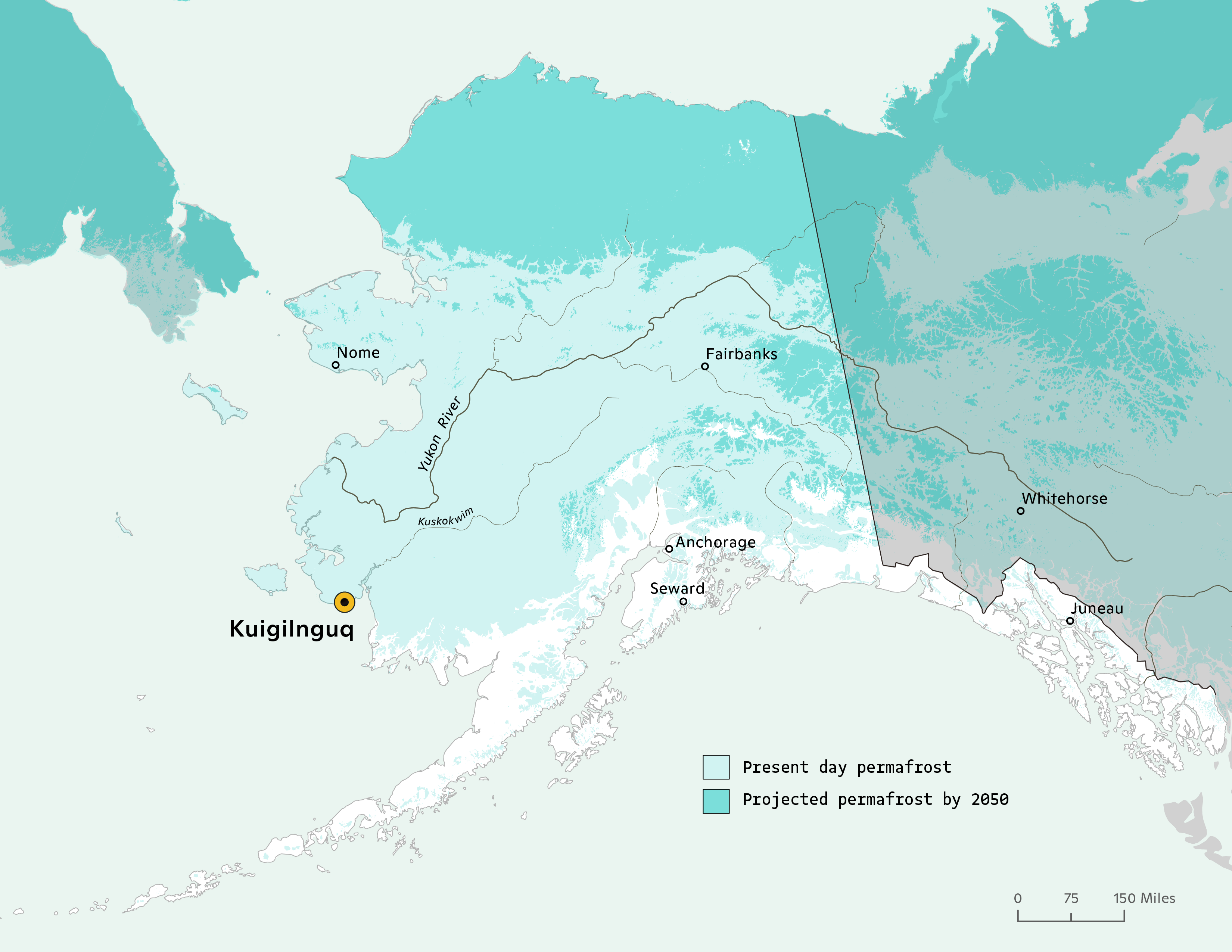
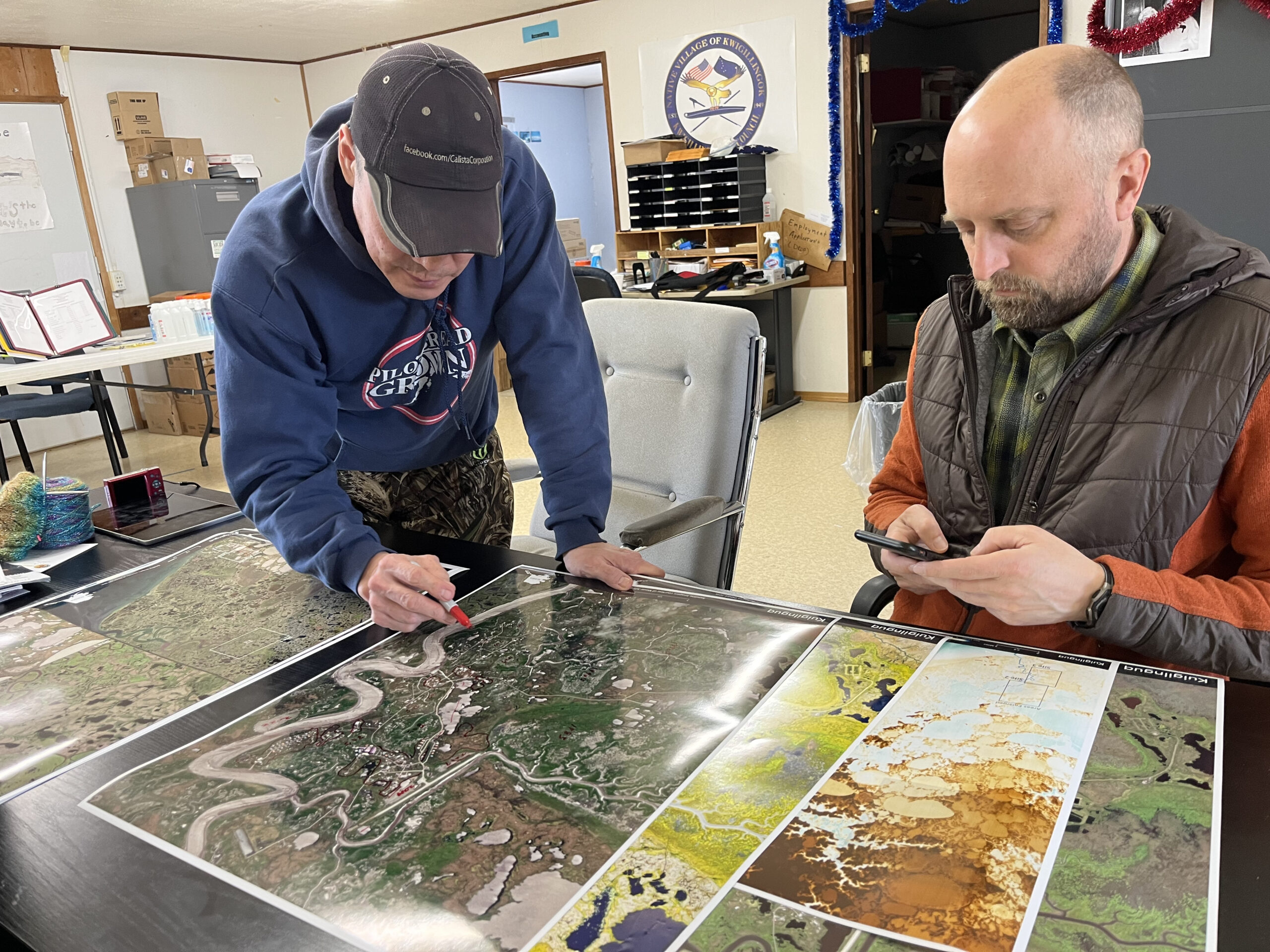
Native Village of Kuigilnguq. Map by Greg Fiske / Woodwell Climate Research Center
News you can use
When you open the app, a map of the globe splits a red and black dashboard. In the upper right-hand corner, you can choose any place in the world using a place name or map coordinates.
Choose, for instance, the Native Village of Kuigilnguq (59.87, -163.16), a coastal community in Southwest Alaska whose residents are working to relocate homes and infrastructure because of climate warming-caused flooding and permafrost thaw.
Once you click the search icon, the map will show you the location you chose and on the left-hand rail, you can choose how many decades of trends to view. If you select “20 years,” you can see that Kuigilnguq has warmed ~1.03 degrees C each decade over the last 20 years and lost approximately three days of frozen ground per decade.
While these remote sensing data deliver only approximations of on-the-ground trends, they are a useful way to explore the longitudinal varied trends across the Arctic.
“This collaboration allows us to use state-of-the-art geospatial tools to visualize changes in the Arctic,” said Brendan Rogers, deputy lead of Permafrost Pathways and associate scientist at Woodwell Climate. “It’s challenging to address problems we can’t always picture, so tools like this can really help us to better visualize and address permafrost thaw.”
Beyond the trend lines
One thing the app can’t do is to illustrate climate impacts, or what an extra degree of heat in a single decade means for the historically frozen land and for the people who live on it.
Arctic residents have been experiencing and adapting to hazardous climate impacts for decades, and these impacts affect communities’ health and well-being in major ways, from subsistence to water quality to the integrity of buildings and roads.
Some are now having to make the difficult choice to relocate their entire communities. To do that, some Alaska Native communities, like Kuigilnguq, are mapping and measuring alongside Permafrost Pathways researchers the areas of flooding in the village and the sites they’ve identified to relocate to ensure that they are moving to more stable ground.
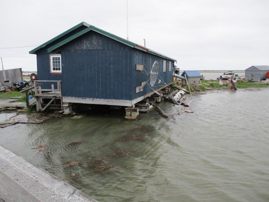
Left: Tidal flooding in Kuigilnguq. Photo by Gary Evon / Native Village of Kuigilnguq.
Right: Former Permafrost Pathways Tribal Liaison, Gary Evon, and Greg Fiske co-producing a community flood map in Kuigilnguq. Photo by Sue Natali / Woodwell Climate Research Center
What other tools are researchers using to learn about Arctic warming?
The TABZ app showcases just two of the tools that researchers use to measure warming in the Arctic-boreal zone.
Field measurements like permafrost coring and soil sampling, monitoring greenhouse gasses with eddy-covariance towers, and mapping wildfire and abrupt permafrost thaw using satellite imagery are some of the other important ways that the Permafrost Pathways and Woodwell Climate teams are documenting rapid change in the North and what those changes mean for Arctic communities and ecosystems. You can learn more about these efforts at Permafrost Pathways.
Want to explore how to get the most out of the TABZ app? Check out this free tutorial.
Go to top